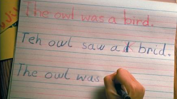
Designing for Dyslexia

- Text size - never smaller than 12 pt. font;
- Text scaling - use % or em to allow for scaling;
- Font style - avoid serif fonts. Arial and Helvetica are good choices;
- Capitalization - avoid as it can give the impression of shouting;
- Background - avoid high contrasting white background as it may make text harder to read;
- Spacing - spacing between paragraphs helps to break up text;
- Justification - avoid as it can create distracting negative space between words;
- Italics - avoid as they can be hard to read;
- Paragraphs - keep them short;
- Use lists to bullet point items - this keeps information organized;
- Writing style - consider your audience's reading level;
- Navigation - keep this consistent throughout your site;
- Moving text - avoid as this is distracting;
- Columns - keep column width under 80 characters long;
- Pictures - use them when possible to help aid comprehension;
- Document structure - keep as simple and organized as possible;
- Abbreviations - always spell out first instance of an abbreviation;